The data used in our exploration comes from a collection of NSF Research Awards Abstracts consisting of 129,000 abstracts, collected by researchers at the University of California, Irvine. The data set is rather massive however (more than 500 MB), so some preprocessing is necessary before exploring our subset of interest with R.
In this final installment, we will be revisiting some previous plots, beautifying them (or I’ll try…) and exploring our assumptions a bit more if we can.
The Perl scripts will all be the same as in the previous installments. I’ll link to these parts, so we will know which data to grab, or which scripts to run.
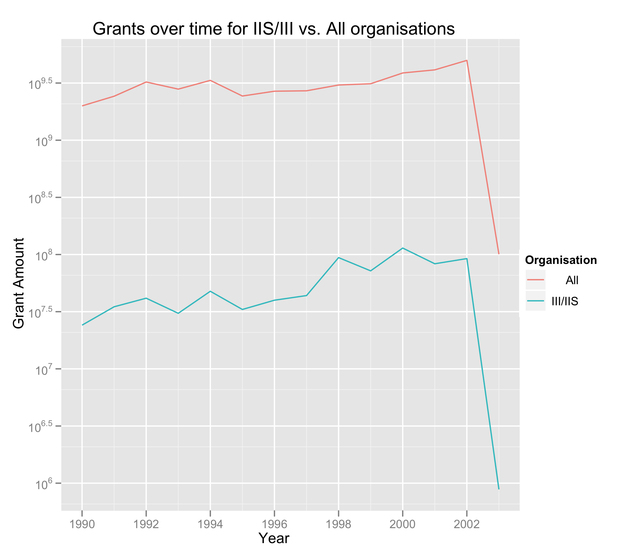
In Part 2, I looked at how funding changed with time for all NSF Organisations. I also used a bar chart. Now that I am a bit more comfortable with R and gglot2, let’s make it a line chart. This time, we would like to compare IIS/III with the total.
Read in the data:
ga <- read.table("http://www-personal.umich.edu/~ryb/resources/amounts.tsv", sep = "\t", col.names=c("Year", "NSF Organisation", "Grant Amount"))
Clean (remove missing grants, convert to “numeric” from “int” to prevent integer overflow):
ga <- na.omit(ga)
ga$Grant.Amount <- as.numeric(ga$Grant.Amount)
Summarise grant amounts by year:
grant_by_year <- aggregate(ga[3], by=ga[1], FUN="sum")
Get the grants for Information (caution: the “or” operator is only one pipe!):
info_grants <- ga[ga$NSF.Organisation == "III" | ga$NSF.Organisation == "IIS",]
Summarise Information grants:
info_grants_by_year <- aggregate(info_grants[3], by=info_grants[1], FUN="sum")
We’ll concatenate the two sets together. We’ll specify groupings here so we can easily put two lines on the same plot:
info_grants_by_year$Organisation <- "III/IIS"
grant_by_year$Organisation <- "All"
groups <- rbind(info_grants_by_year, grant_by_year)
groups$Organisation <- factor(groups$Organisation)
And we plot. Funding for all groups is so much higher than for III & IIS that we need to make it a log plot:
p <- ggplot(groups, aes(x=Year, y=Grant.Amount, group=Organisation, colour=Organisation))
p + geom_line() + scale_y_log10() + ylab("Grant Amount") + opts(title="Grants over time for IIS/III vs. All organisations")
It looks like there is an uptick of funding in 1994, which could possibly relate to the release of Mosaic–the first “consumer” Web browser.
Similarly, there are increases in 1998 and 2000, which seems as though they could relate to the dot-com bubble, and the decline to the bust. This is conjecture, of course – there was a decline in 1999 as well. It’s a pity that we don’t have data from 2004 onward—it would have been interesting to see if the Web 2.0 bubble has had any impact.
In both cases funding is increasing, but Information-related funding seems to be increasing at a slightly faster rate than the aggregate, which seems like a pretty good thing.
In Part 5 I made a few plots to see where the most highly funded research areas are. We’ll revisit these, focusing on IIS/III grants while removing places that aren’t actually states in the process to get a more reasonable view of our data.
To keep only the U.S. states, I wrote a script to process the tab-separated file. This may or may not be “cheating”, but R can be part of a larger ecosystem…
I used a table on Wikipedia and imported it into Google Spreadsheets. Simply type =importHTML("http://en.wikipedia.org/wiki/List_of_U.S._state_abbreviations", "table", 2) into a cell and watch the magic happen.
Let’s read in the new data:
ga <- read.table("http://www-personal.umich.edu/~ryb/resources/info_states_for_real.tsv", sep = "\t", col.names=c("Year", "NSF Organisation", "Grant Amount", "State"))
And plot:
ggplot(s) + geom_bar(aes(State)) + ylab("Count") + opts(title="Number of grants by state") + coord_flip()

Surprise, surprise, California is the highest! We can also see other states with particularly well-known schools being represented as well, including Pennsylvania (cf. UPenn), New York (cf. Columbia University), Massachusetts (cf. MIT, Harvard), and Illinois (cf. UIUC). Apparently NSF grants are actually a small portion of the total potential funding, but perhaps this could be representative of the relative binning.
When we look at the grant amounts however, the California advantage doesn’t seem as great. States like Virginia, New Hampshire, and North Carolina have higher means.
ggplot(s, aes(State, Grant.Amount)) + coord_flip() + ylab("Award") + opts(title="Grant Amounts by state") + scale_y_continuous(trans='log10') + geom_boxplot()
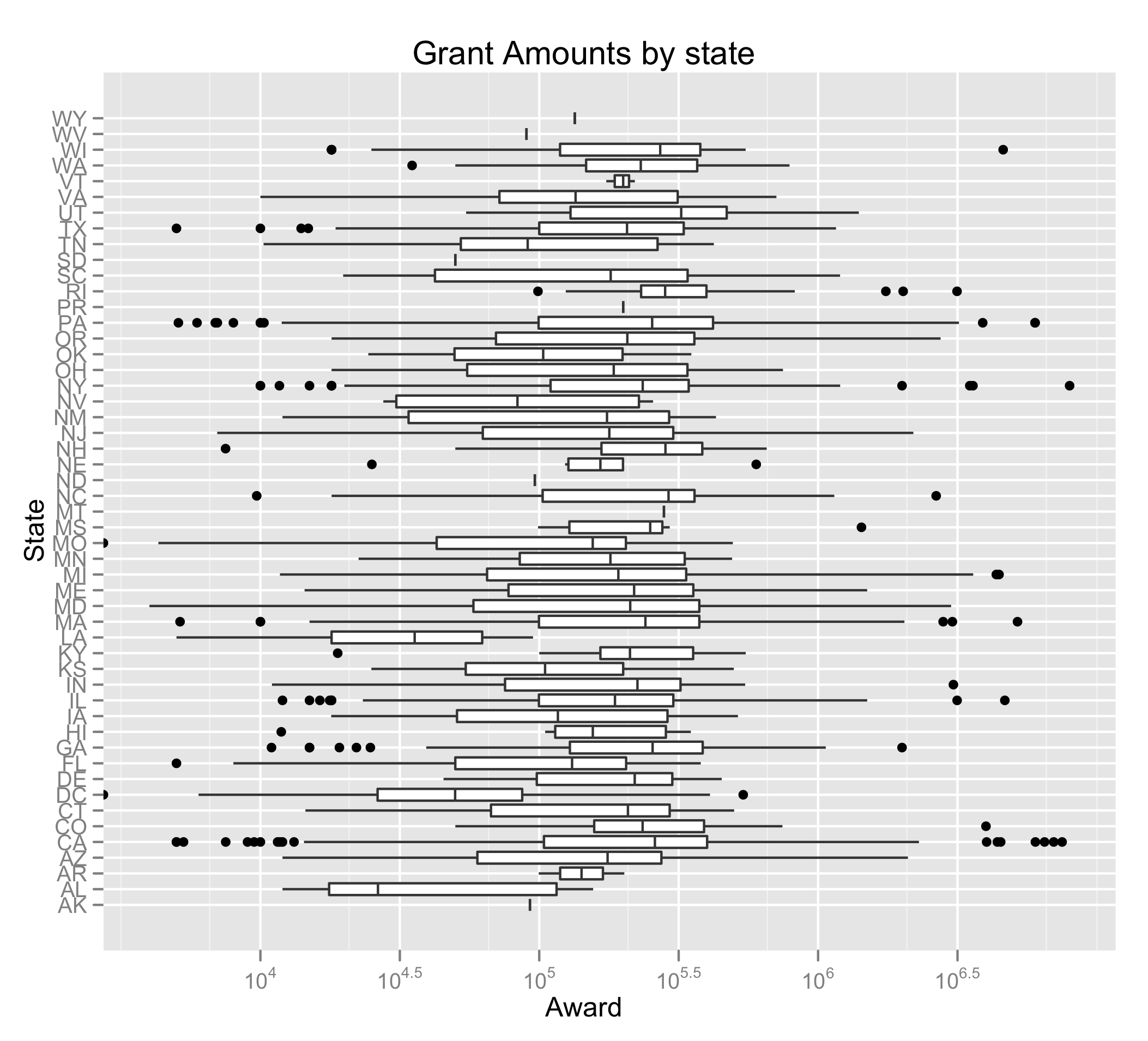
This could suggest that they work on larger projects, which, depending on your goals could alter where you ought to think of doing your research. Think about it like this: Would you rather work with a larger or smaller team? Because the overhead and coordination costs are higher when more people are involved, this is likely reflected in the sum of the grants given. For myself, I would choose the latter. Of the five states previously mentioned, Illinois has the smallest mean, which might make it a good candidate.
In Part 4 I explored word usage in the abstracts that were awarded funding. I’ll explore these again in a different way.
Previously, we plotted the words on a logarithmic plot based on rank and frequency (as is common when looking at Zipfian distributions). This time, we will present a list of words, where the size is based on the relative frequency of the next most common word. Unfortunately, the words have lots of overplotting, so we’ll jitter them.
We’ll keep only the most common words (more than 100 mentions).
p <- ggplot(subset(t, Word.Count > 10^2), aes(x=1, y=Word.Count, label=Word, size=log(Relative.Increase), colour="importance"))
Note that we remove everything along the x-axis, since they’d have no meaning.
p + geom_text(alpha=I(7/10), position="jitter") + scale_y_log10() + opts(title="Most common words used in Information-related abstracts\nsized by relative increase in frequency", legend.position="none", axis.text.x = theme_blank(), axis.title.x = theme_blank(), axis.ticks = theme_blank()) + ylab("Word Count")
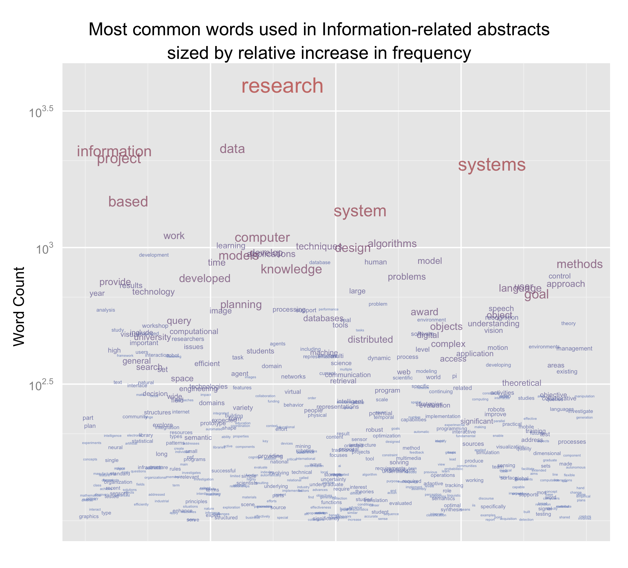
The size of each word tells us how much more frequent it is than the next most requent word the most obvious example is “research”, which is mentioned over a thousand times more than data. Data itself isn’t mentioned all that much more than information. The colour should help us make sense of whether words appear at the same level – those words closer to blue are also closer to the previous word and are thus on roughly the same level. Those closer to red are more frequent.
We now want to see words that are actually special to information-related fields. We’ll use the probability of the word occuring in the information abstracts as a measure of how specialised the word is.
To move towards calculating this, we need the document frequency. We’ll create some views in our SQLite3 database.
create view information as select docid from docids, (select filename from orgs_filenames where org in ("III", "IIS")) as information where information.filename = docids.filename;
create view doc_freq as select word, count(docid) as df from words, freqs where words.wordid = freqs.wordid group by word;
create view info_doc_freq as select word, words.wordid as wordid, count(docid) as df from words, freqs where words.wordid = freqs.wordid and docid in information group by word;
And the “query”:
select words.word, sum(freq) as wc, doc_freq.df as all_df, info_doc_freq.df as info_df from words inner join freqs where freqs.docid in information on words.wordid = freqs.wordid left join doc_freq on words.wordid = doc_freq.wordid left join info_doc_freq on words.wordid = info_doc_freq.wordid group by words.word, doc_freq.df, info_doc_freq.df order by wc desc;
I really should note that this didn’t work. I had to create actual indexed tables from the views, create a table from the raw frequencies, and write a separate query to sum the frequencies. I won’t go into that, but apart from creating new tables, I guess that the view/query combination would give us the same thing in a few days.
Loading in the data:
t <- read.table("freqs_all.tsv", sep="\t")
t$importance = 100^(I(t$V4/t$V3))
t$importancelevel <- cut(t$importance, breaks=5, labels=c("Very Low", "Low", "Medium", "High", "Very High"), ordered=TRUE)
p <- ggplot(subset(t, importance > 3), aes(x=1, y=1, label=V1, size=log(V2)))
p + geom_text(aes(colour=log(as.numeric(importancelevel) + V2)), alpha=I(7/10), position="jitter") + scale_y_log10() + opts(title="Most \"specialised\" words used in Information-related abstracts\nsized by frequency", legend.position="none", axis.text.x = theme_blank(), axis.title.x = theme_blank(), axis.text.y = theme_blank(), axis.title.y = theme_blank(), axis.ticks = theme_blank(), panel.grid.major=theme_blank(), panel.grid.minor=theme_blank()) + ylab("Importance") + facet_grid(importancelevel~.)
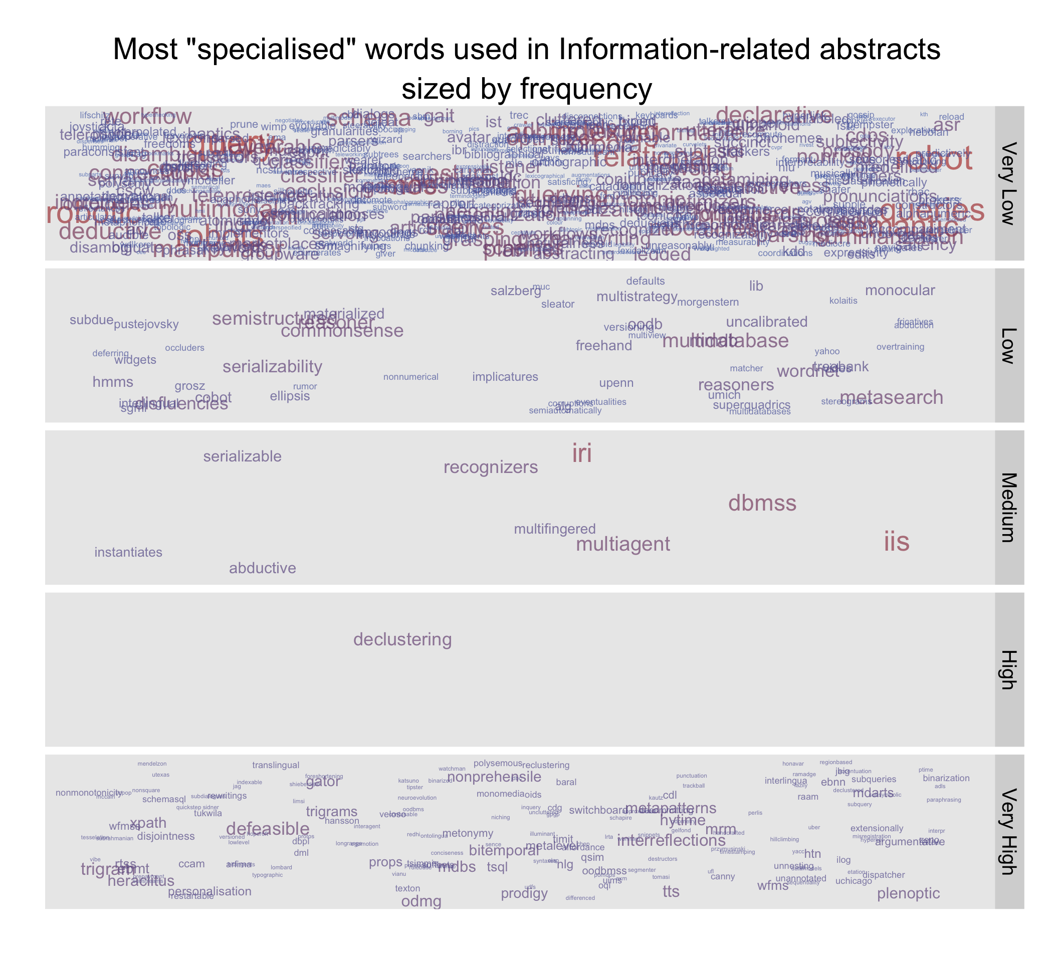
I suppose that this is something more of a tag cloud, but we can see that the most frequent words in information abstracts are also likely to be mentioned in other fields as well. I suppose the difference would come from the meaning.