

 Background Information about Asthma
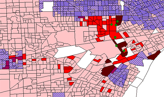
Location of Industries
These are 11 of the top 20 polluting industries in Wayne county, according
to EDF's scorecard.
One other industry, Allied Signal Inc. is located on Zug Island. That
industry is believed to be causing
the high prevealence in the darkest red block group in the map below.
Power plants and municipal
incinerators do not submit pollution data for the Toxics Release Inventory.
Those polluters have not
been fully explored.
Asthma Prevalence


As can be seen from the above map, asthma prevalence per block group
correlates quite well
with the locations of the major industrial polluters. The white
block groups in the map are block
groups where ESRI does not have information about the block group population.
Locations of Oakwood Hospital and ACCESS


Oakwood Hospital is not situated directly adjacent to the block groups
which have high asthma
prevalence. This indicates that the location of the hospital
is not adversely biasing the data.
Detroit has the largest Arab American population in the United States.
ACCESS is an Arab
community center located near the heart of the Arab community.
This is relevant for two reasons:
1) Census data does not have a separate race category for Arabs and
2) ACCESS is located
close to some of the block groups with the highest asthma prevalence.
Correlation
Between African Americans and Asthma Prevalence

The correlation between African Americans and Asthma Prevalence is
not strong. In general,
there are low numbers of African Americans throughout the areas served
by Oakwood Hospital.
Correlation Between Median Value of a Home and Asthma Prevalence


In general, there is a high correlation between areas of high asthma
prevalence and areas where
there is low median value of a home (0-$58,700). This is not
surprising since lower income
communities are frequently subject to environmental pollution and other
factors which can lead to
poorer health.
Correlation Between Census-Defined "Other Ethnicities"
and Asthma Prevalence


The census defines other ethnicities as immigrants, who are not yet
considered Americans. Interestingly,
this map looks the same as the map portraying African Americans (2
maps above). Similarly, this map
shows a negative correlation between areas of high prevalence and areas
of high Immigrants.