Back to Science & Society Lesson Home Page
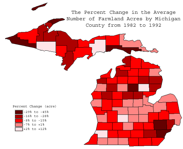
This map illustrates the percentage change from 1982 to 1992 in the
total number of acres in the county that are classified as farmland.
The increasingly darker shades of red reflects an increasing percent of
farmland that has been lost to some other use.