Back
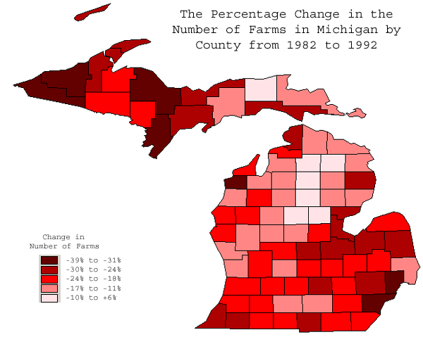
Map 1: This map illustrates the percent change in the number of farms in each county
for the 10 year period of 1982-1992. As you can see the shade of red
becomes darker it reflects a greater the percentage decrease in the number of farms,
thus the total number of farms in each county tend to be decreasing.
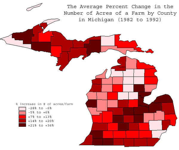
Map 2: This map illustrates the percentage change in the acres of the average
farm
in each county of Michigan from the years 1982 to 1992. The darker
red colors indicate greater increases in farm size. As you can see
while the first map indicates that in general the number of farms per county
tends to decrease, this map indicates that at the same time the average acreage
of each farm tends to be increasing. Perhaps some
of the land from the lost farms are being picked up by other farms.
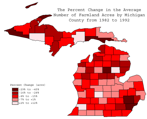
Map 3: This map illustrates the percentage change from 1982 to 1992 in the
total number of acres in the county that are considered to be farmland.
The increasingly darker shades of red reflects an increasing percent of
farmland that has been lost to some other use.
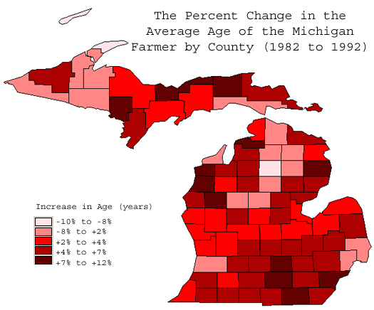
Map 4: This map illustrate the percentage change in the average age of the
farmers in each county of Michigan in the years 1982 to 1992. While some
counties have seen a decrease in the average age (shown by lighter red colors),
the darker red colors indicate that the average age of the farmers have
increased.
Back