Generating and Using a Calibration Graph
The Calibration Graph
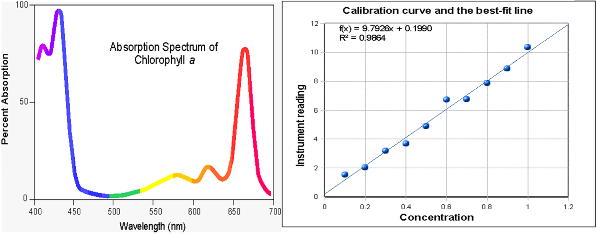
When you take an absorbance spectrum, you are looking at the absorbance based on wavelength. But when making a calibration graph you are looking at the absorbance based on concentration.

The two plots above are an Absorbance spectrum on the left, and a calibration plot on the left.
Both are plotting absorbance, but the spectrum plots it vs. wavelength (molar absorptivity constant) and the calibration plot is vs. concentration.
Try a Math Question about the two graphs above!
Show/hide comprehension question...
IMPORTANT NOTE!!!!!!
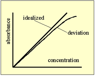
Beer's Law ONLY is linear at LOW concentrations!
If the absorbance of your sample is above 1.0 you will need to dillute your sample in order to lower the absorbance

You cannot extrapolate your calibration line, because there is a deviation from a straight line at higher concentrations.
Having trouble with straight lines? Not to worry, here are some very helpfull sites to help you out!
- For information on "The Equation of a Straight Line"
- For information on "Best Fit Line"
- For information on "Scatter Plot with Fitted Regression Line (Excel)" 2003 Format