|
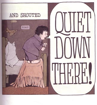
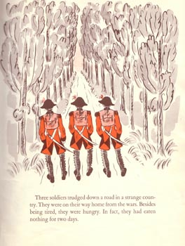
From Into the Night Kitchen, copyright Harper and Row, 1970. Most of this book has text similiar to the "and shouted" above. When the illustrator needs to show how loud the this particular statement is supposed to be, he changes the size of the text to visually impress the reader. Even without the word "shouted" preceding it, it is obvious that these words are meant to be forceful. Another way to change the tone in the story is to change where the words are placed relative to the picture. Readers tend to look from the top down so text at the top should serve to describe what the reader is about to see. This type of text is generally more free-standing and uses the pictures as more of a bonus. Text at the bottom explains what has just been seen and often relies on the picture to push the story to a greater extent. Text to the side of the pictures can go either way although text to the right is usually perceived similiar to text at the top and vice versa. In some stories, the text moves around. This forces the reader to look for the text explicitly is usually used when the text and the pictures are very intertwined. (Nodelman 54-58) Perfect examples of this can be found in Mercer Mayer's There's A Nightmare in My Closet and Marcia Brown's Stone Soup.
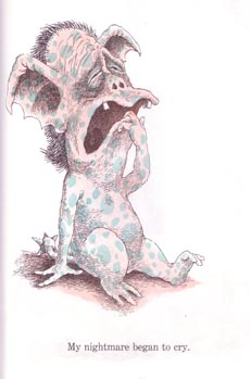
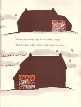
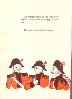
From There's a Nightmare In My Closet, copyright Penguin Books, 1968. In this book, There's A Nightmare in My Closet, the words are always displayed below the pictures they describe. The words are simple and generally compliment the pictures rather than the other way around. We look at the nightmare first and see that it is crying. The words confirm this and we move on. In the classic Stone Soup, the text and pictures often change places as they are interwound throughout.
From Stone Soup, copyright Charles Scribner's Sons, 1947. In this way, the pictures do not rely on the text and text does not rely on the pictures. When Brown wants you to read the text first she puts it at top and vice versa. In our story, the text is large and easy to read. It is inviting and in a simple font throughout. The text changes font and location to show changes between narration and character voice. Key words in the narration are also in bold typeface for emphasis. Finally, the text changes location when the characters are speaking so as to draw the eye to their words
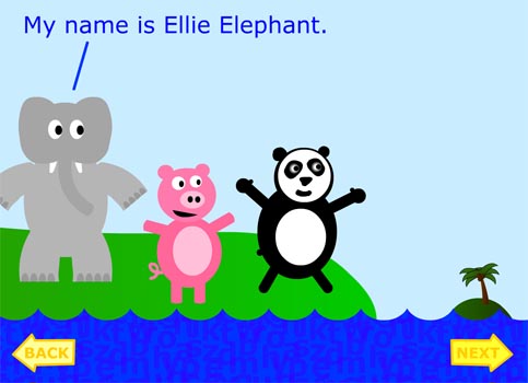
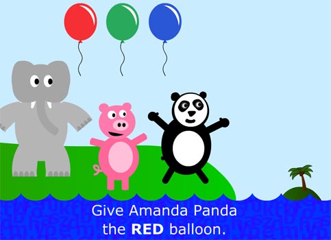
From Adventures in the Alphabet Ocean, copyright 2004. The narration text is at the bottom with word "red" in bold so children key in on the color.
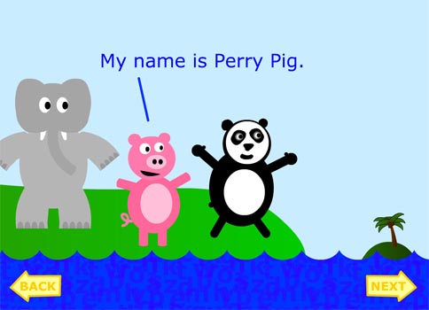
From Adventures in the Alphabet Ocean, copyright 2004. Here the text changes location, forcing the reader to notice the new text. [ Back ] [ Next ] |
| Home | Background Research | Activities | Resources | Works Cited | About Us |
 .
.