|
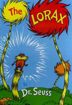
From The Lorax, copyright Random House, 1971. This is the cover of The Lorax by Dr. Seuss. Dr. Seuss' books were typically designed to be in a large format and used this to feature large, brightly colored drawings. A cover like this shows a child that the story inside will be livey and the pictures will be large and easy to follow. (Nodelman 44) These books are perfect for reading aloud to groups of children.
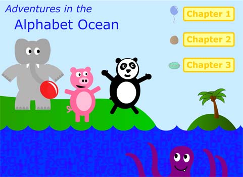
The cover of Goodnight Moon by Margaret Wise Brown also has fairly bright colors but it's small format gives readers the impression that it is meant to be read by just one person or perhaps one person reading to a child. In fact, this is exactly what the author intended, for the book to be read to a child at bedtime. (Spitz 27) The small format allows for the child to hold the book easily and to point out the objects as they are listed off. The stories of small format books are also what author Perry Nodelman calls, "fragile and delicate." (Nodelman 44) Our story does not have a cover per se but, rather, a title page that serves as the cover, as well as the table of contents. Still, some of the same principals apply. The story is meant to be viewed on as large a screen as possible as it comes up maximized in the browser window. It is very colorful and lively, inviting to the eye of a child and also features animations to further engage the reader.
From Adventures in the Alphabet Ocean, copyright 2004. This is characteristic of the story as a whole. It is meant to be fun and engaging a the cover shows exactly that. [ Research Main ] [ Next ] |
| Home | Background Research | Activities | Resources | Works Cited | About Us |