|
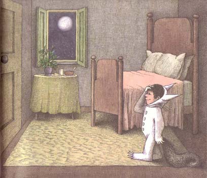
From Where the Wild Things Are, copyright Harper and Row, 1970. In this image, the final illustration from Where the Wild Things Are, Max has just returned home from the "where the wild things are." The floor and the bed are flat and comforting and the colors are peaceful yellows and pinks. Sendak has chosen these scheme to bring Max from a wild place to his home, a safe haven where he can eat his supper and go to bed.
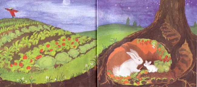
From Runaway Bunny, copyright Harper and Row, 1942. In this image, the final pages of Runaway Bunny, the bunny and his mother return to their home after many adventures through the imagination. Again, the gently rounded hillsides and warm greens, blues, and oranges represent a safe and stable place. In our story, the settings are generally smooth and are made up of light colors, generally green and blue. This is because the story is set in a fun but safe and comfortable world. Also, green and blue bring up images of nature and growth, positive and enjoyable thoughts. In addition, the smooth, round, green island can be contrasted with the jagged sea.
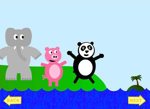
From Adventures in the Alphabet Ocean, copyright 2004. The island is meant to be a safe place, a haven where learning and fun can thrive. The sea is something to be avoided, a challenge to overcome. A flat sea or a mountainous island would not evoke the same response. [ Back ] [ Next ]
|
| Home | Background Research | Activities | Resources | Works Cited | About Us |