Generating and Using a Calibration Graph
How to Work with Plots

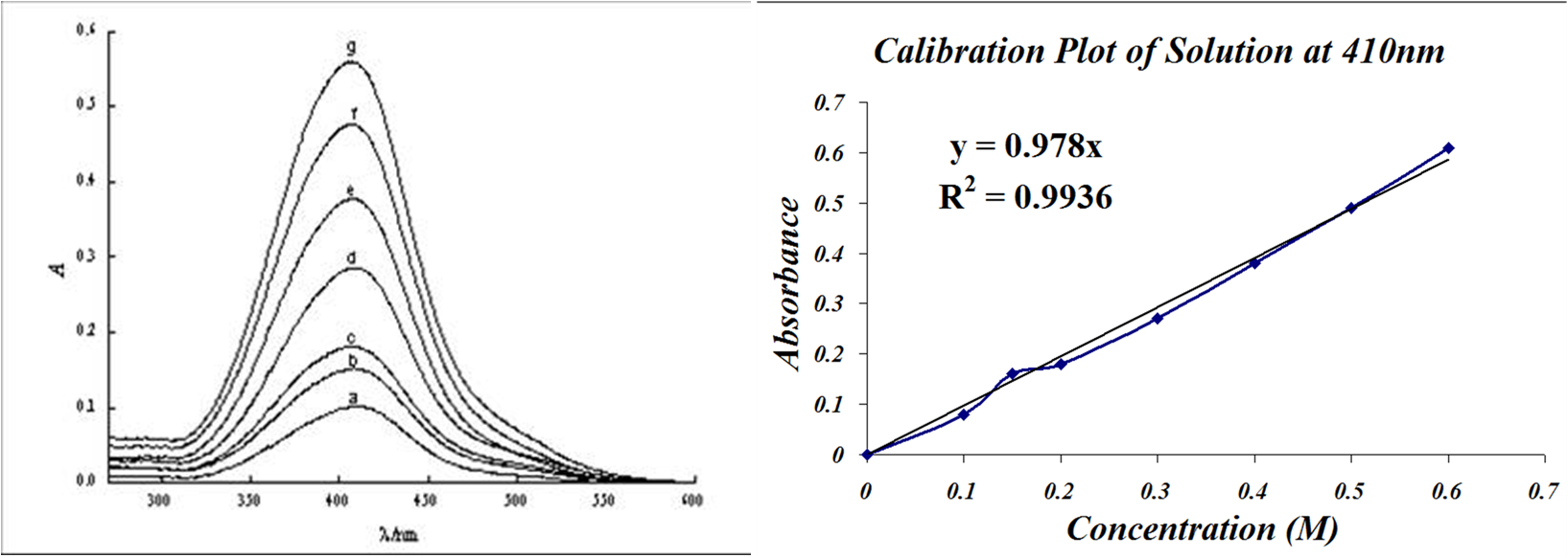
You have two different plots, you absorbance spectrum on the left, and your calibration plot on the right.
First a couple questions
First look at the absorbance spectrum. These spectra were taken using different concentrations.
Show/hide comprehension question...
Choosing Your Wavelength

Look at the images above. The left is an absorbance spectrum of 0.13mM plastocyanin, while on the right is a calibration plot at two wavelengths.
You can choose any wavelenght to create a calibration plot, the only differerence will be the slope of the line.
When you actually choose your wavelength to create your calibration graph, you would generally like to choose a wavelength where there is room for the concentration to decrease. Look at the spectrum above. Do you think 450nm would be a good wavelength to use for a calibration graph? You would not choose that wavelength because when you lower the concentration, you would not be able to see much of a difference in the absorbance, and the calculations would be inaccurate. You would most likely want to choose wavelengths like 600nm or 250nm where there is a lot of room for absorbance change.

