—
Gelman Chapter 11-11.2 examples
21 Sep 2020
Chapter 11-11.2
11.1 Assumptions of regression
11.2 Plotting data and fitted model
Displaying a regression line as a function of one input variable
(recap of fig 10.2 in section 10.1)
import delimited https://raw.githubusercontent.com/avehtari/ROS-Examples/master/KidIQ/data/kidiq.csv,  clear
qui regress kid_score mom_hs mom_iq
Yet another way to show a fitted line, at least for single predictors, beyond the three illusrated in Chapter 10 is using the graph type lfit
twoway (scatter kid_score mom_iq) ///
        (lfit kid_score mom_iq) ///
        ,ytitle(Child test score) xtitle(Mother IQ score) ///
        ylab(20(40)140) xlab(80(20)140)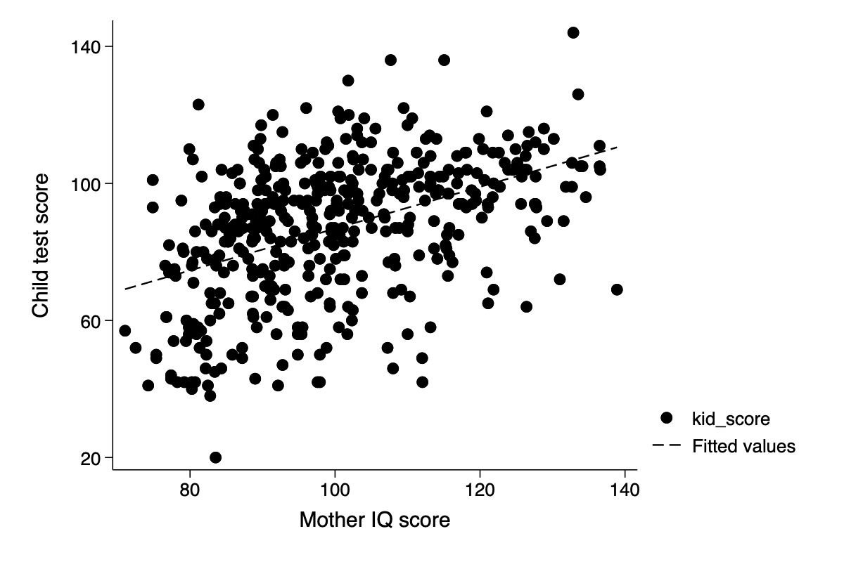
Displaying two fitted regression lines
Model with no interaction (recap of fig 10.3 in section 10.1 using margins)
cap drop HS*
qui separate kid_score,by(mom_hs) gen(HS) short
qui regress kid_score c.mom_iq i.mom_hs
qui margins mom_hs ,at(mom_iq=(60(20)140))
marginsplot, noci plot(,labels("pred. no HS" "pred. HS")) ///
    ytitle("Child test score") xtitle("Mother IQ score") title("") ///
addplot(scatter HS0 mom_iq,ms(o)|| scatter HS1 mom_iq,ms(oh) ) 
Model with an interaction
(recap of fig 10.4 in section 10.1 but using margins to plot the predicted levels)
cap drop HS*
separate kid_score,by(mom_hs) gen(HS) short
qui regress kid_score i.mom_hs##c.mom_iq
qui margins mom_hs ,at(mom_iq=(60(20)140))
marginsplot, noci plot(,labels("pred. no HS" "pred. HS")) ///
    ytitle("Child test score") xtitle("Mother IQ score") title("") ///
addplot(scatter HS0 mom_iq,ms(o)|| scatter HS1 mom_iq,ms(oh) ) 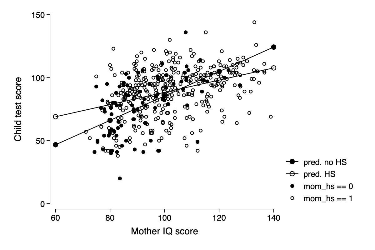
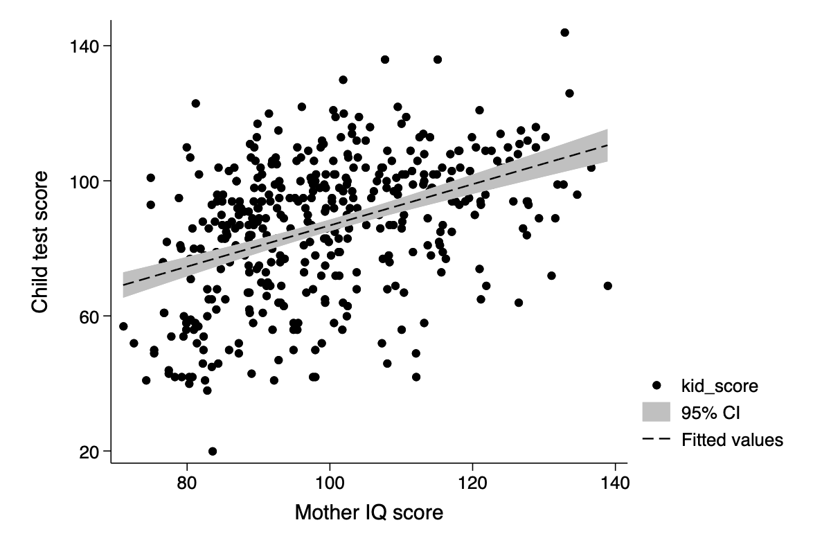
Displaying uncertainty
Here we can display uncertainty around the expect means using the lfitci graph type
qui regress kid_score mom_iq
twoway (scatter kid_score mom_iq) ///
        (lfitci kid_score mom_iq) ///
        ,ytitle(Child test score) xtitle(Mother IQ score) ///
        ylab(20(40)140) xlab(80(20)140)
(file /Users/thofer/Box/sites/umich(secure)/hhcr/raos_gelman/img/fig11_1_stata.png written in PNG format)
Displaying using one plot for each input variable
- kid_score vs mom_iq at mean high school
qui regress kid_score c.mom_iq i.mom_hs
qui margins ,at(mom_iq=(60(20)140)) atmeans
marginsplot , recastci(rarea)  ///
    ytitle("Child test score") xtitle("Mother IQ score") title("") ///
    addplot(scatter kid_score mom_iq,ms(o) ) ///
xsize(5) ysize(5) legend(off) xlab(80(20)140) 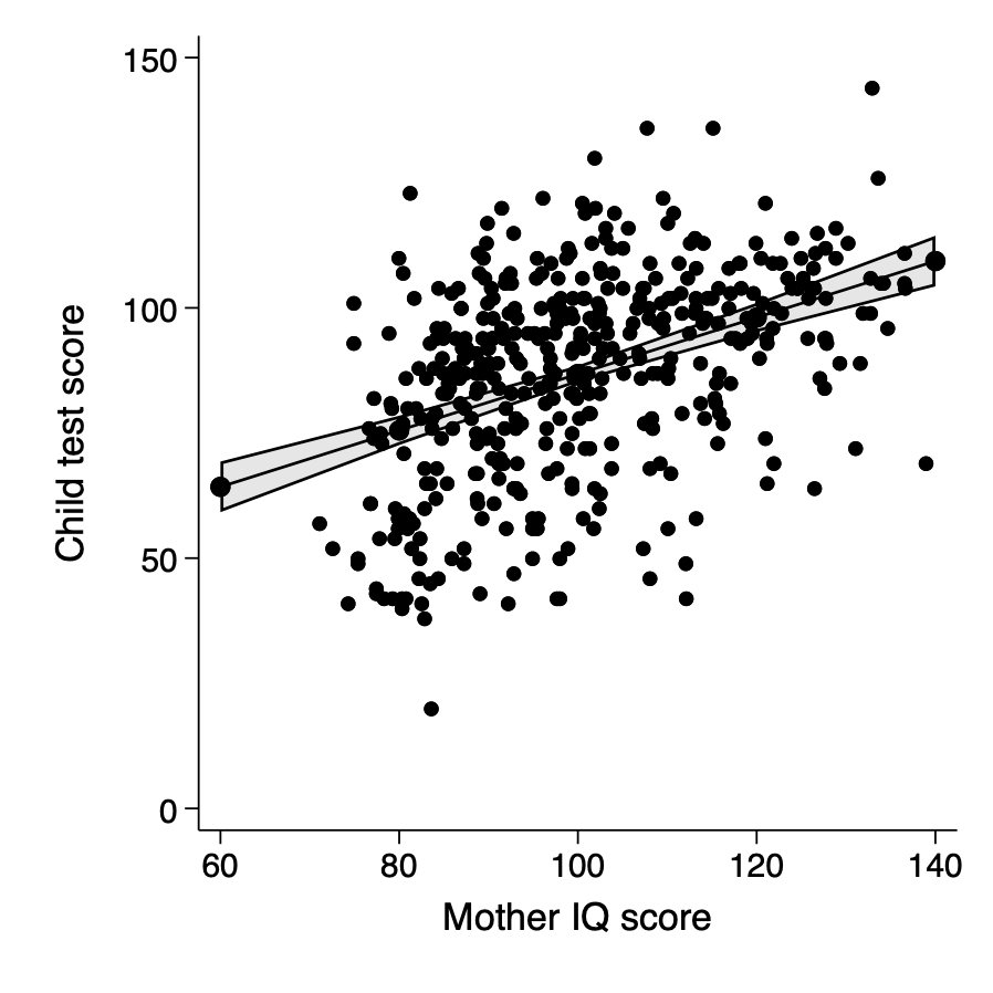
- kid_score vs high school at mean IQ
qui margins mom_hs, atmeans
marginsplot , recastci(rarea)  ///
    ytitle("Child test score") xtitle("Mother IQ score") title("") ///
    addplot(scatter kid_score mom_hs,ms(o) jitter(5) ) ///
xsize(5) ysize(5) legend(off) xlab(80(20)140) 
Plotting the outcome vs a continuous predictor
clear
set obs 100
set seed 44932
gen x=uniform()
gen z=uniform()>0.5  // about half 0 and half 1
local a=1
local b=2
local theta=5
local sigma=2
gen y=`a'+`b'*x + `theta'*z + rnormal(0,`sigma')

regress y c.x i.z
label define zlab 0 "z=0" 1 "z=1"
label values z zlab
scatter y x || lfit y x ||,by(z,legend(off) note(""))  ///
ytitle("Outcome,y") xtitle("Pre-treatment predictor, x") 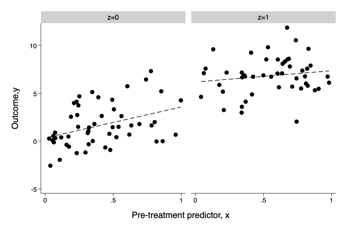
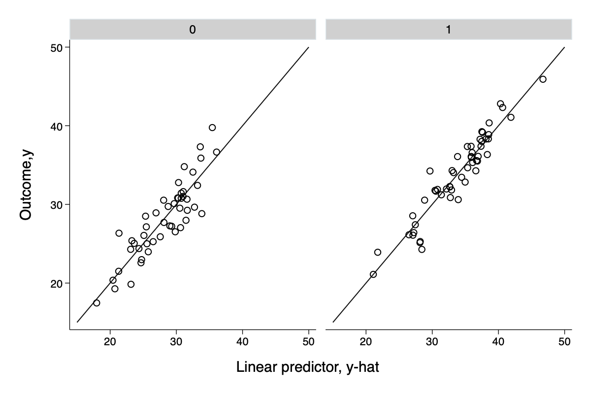
Forming a linear predictor from a multple regression
clear
set obs 100
set seed 932
local K=10
forval i=1/`K'    {
    gen x`i'=uniform()
}
gen z=uniform()>0.5  // about half 0 and half 1
local a=1
local theta=5
local sigma=2
gen y=`a'+ 1*x1+ 2*x2+ 3*x3+ 4*x4+ 5*x5+ 6*x6+ 7*x7+ 8*x8+ 9*x9 +10*x10 ///
    + `theta'*z + rnormal(0,`sigma')
regress y x* z
predict y_xb
twoway function y=x ,range(15 50) ||scatter y y_xb || ,by(z,legend(off) note(""))  ///
    ytitle("Outcome,y") xtitle("Linear predictor, y-hat") ///
    ylab(20(10)50) xlab(20(10)50) ysc(fextend) xsc(fextend)